More ill-advised COVID-19 modeling
We’re now several months into the coronavirus outbreak in the United States, and at least some areas are starting to progress toward opening back up. Back in March, I ran some crude simulations to explore possible outbreak scenarios and understand the impact of social distancing measures. In this post, I revisit that modeling exercise, and take a stab at answering some basic questions like “how many people have caught COVID-19 near me?” and “how many people are infectious right now?”
Disclaimer
I’m not an epidemiologist!!! The models used here are extreme simplifications of a complex and evolving outbreak, and will diverge from reality in significant and consequential ways that may not be readily apparent in the analysis contained herein. This blog is not a substitute for expert medical advice! (You shouldn’t be taking medical advice from random strangers on the internet in general!)
Recap of last time
In my previous COVID-19 post, I ran some simulations for possible outbreak progression and the impacts of social distancing under the following assumptions:
- The incubation period for the virus is estimated to be between 1 and 14 days (although possibly up to 24 days), with a median of 5 to 6 days. The incubation period is the length of time between when a patient is infected with the virus and when symptoms begin.
- The reproductive number ($R_0$) is estimated to be between 2 and 3. The reproductive number is the expected number of secondary cases produced by a single infected person in a susceptible population. [source]
- The case fatality rate (CFR) is estimated to be between 1 and 2% [source], or between 1.8% and 3.4% in America [source] (note that this is heavily impacted by population demographics).
- About 80% of cases are mild (not requiring hospitalization) and 20% are severe or critical.
- The median time from onset to clinical recovery for moderate cases is 2 weeks and for severe or critical cases is 3 to 6 weeks. Among patients who have died, the time from symptom onset to outcome ranges from 2 to 8 weeks. [source]
This resulted in some pretty grim scenarios without social distancing, e.g. 88% of the population infected, 2.4% of the population dead, etc. Obviously, this hasn’t happened (yet). So, where were the errors in the simulation?
What we’ve learned since March
- The case fatality rate (CFR) seems to be about 6% [source]. The case fatality rate is the number of deaths divided by the number of cases with known outcomes (deaths + recoveries). It represents the chance that a diagnosed coronavirus case will end in fatality.
- The median time from onset to clinical recovery estimates of 2 weeks for mild to moderate cases and 2 to 8 weeks for severe and fatal cases seems approximately correct.
- A larger portion of cases are mild or asymptomatic (and hence go undiagnosed) than originally believed. Consequently,
- The case fatality rate (CFR) is significantly higher than the infection fatality rate (IFR)
- The true IFR is likely between 0.5% and 1% [source]
That last bullet point is the source of the biggest discrepancy: my previous modeling had used a 2.65% IFR, which is probably 3 times more lethal than COVID-19 is in reality. If we repeat the simulation with an IFR of 0.75%, and assume that social distancing reduces $R_{t}$ to 0.6 during lockdown and to 1.2 after contraints are eased, we end up with a simulation that looks a lot more like what seems to be actually happening:
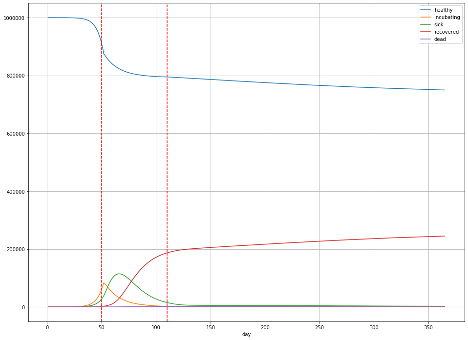
In this scenario,
- Overall, 244,984 people were infected (25% of the population);
- The peak number of sick people was 114,400 on day 65 – 11.4% of the population;
- There are 1894 deaths (189 deaths per 100,000) in total, or a little less than 0.2% of the population.
(Note that these numbers for $R_{t}$ aren’t totally arbitrary: they’re within the ballpark for states like Illinois [source].)
On to the modeling
In the four months that have passed since March, we’ve managed to collect a decent amount of data about the COVID-19 outbreak. The New York Times has even put together a repository with current and historical case counts, which I’ll use as my primary source of data in this post. I’m going to focus on Cook County, Illinois (Chicago and some surrounding suburbs), mainly because that’s where I live—but the NYT repository has county level data all accross the country, so you may easily re-run this analysis.
First, there are two key questions that I’m selfishly interested in understanding:
- How likely am I to catch coronavirus?
- What stage of the outbreak are we in?
The closest answer we can get to question 1 is to look at what proportion of the population is currently infected with COVID-19, and what proportion is expected to catch it over some time horizon (say, the next 100 days). Question 2 is hard to answer in general, but we can attempt an answer under certain assumptions. Start with question 1.
One way to guess at what proportion of the population is currently infected is to take a look at the positive test rate. In Illinois, the Department of Public Health publishes this information (as well as other statistics). We can see, for example, that over the past 5 days, Illinois has done about 144 thousand tests, and recorded 4,516 confirmed cases. IF we assume that this sample of positive results accurately reflects the prevalence of the disease among the population, then we would estimate that about 3.13% of people in Illinois currently have COVID-19.
However, there are reasons to expect that the positive test rate is not a perfectly accurate estimate for the proportion of the population currently infected:
- Tests are not performed at random. Currently, in Illinois, you have to request a test, or your doctor has to order one for you. In either case, in order to get a test, you must already be suspected of having COVID-19. This suggests the positive test rate is higher than the actual infection prevalence.
- Infected persons with mild or no symptoms may not realize they are infected, and thus may not take the test. Mild or asymptomatic cases are thought to make up the majority of COVID-19 infections. This suggests the positive test rate is lower than the actual infection prevalence.
So which one is it? It’s impossible to say without a good randomized sample to compare to, and we don’t have that yet.
What I prefer to look at is the number of reported COVID-19 deaths. This information is, in my opinion, more reliable: we tend to notice and record when somebody dies, and it stands to reason that the majority of COVID-19 deaths would occur in a hospital setting where they are likely to properly attributed to COVID-19. (Note that it’s likely that we are still missing at least a few COVID-19 deaths this way, based on looking at excess deaths over the same period historically.) The challenge with looking at deaths is they don’t tell us much about infections directly—we need a model.
SIR Models
The model I chose to work with for this post is called the Kermack-McKendrick model. It’s the simplest of a family of epidemiological models called SIR models. A SIR model divides a population into three groups:
- Susceptible, the subset of the population that has not yet caught the disease;
- Infected, the subset of the population that has the disease right now; and
- Removed, the subset of the population that can no longer catch the disease (due to either death or immunity).
Let $S$, $I$, and $R$ denote these subsets, and $N$ the total population, so that $S + I + R = N$. In the Kermack-McKendrick model, transitions between states are governed by the differential equations
\[\frac{dS}{dt} = -\beta \frac{S}{N} I\] \[\frac{dI}{dt} = \beta \frac{S}{N} I - \gamma I\] \[\frac{dR}{dt} = \gamma I\]Here, $\gamma$ and $\beta$ are the parameters governing the dynamics of the outbreak. In particular, $\gamma$ is the daily probability of removal: this is the probability that, on any given day, an infected person either dies or recovers from the illness. $\beta$ is the expected number of potential disease transmissions produced per infected person per day.
Don’t be intimidated by the differential equations, they’re actually pretty straightforward!
The first equation is saying that the number of susceptible (never infected) people decreases each day proportional to the average number of potential transmissions per person multiplied by the proportion of transmissions that can actually result in an infection multiplied by the total number of infected people. Note that by “potential transmission”, I mean “transmissions that would occur if the recipient was susceptible” (i.e. not immune or dead). So, at the start of the outbreak, just about everyone a sick person encounters could catch the virus; as time goes on and more people develop immunity (or die), there are fewer opportunities to infect a susceptible person.
The second equation says that the number of infected persons increases each day by the number of new infections, and decreases by the number of removals—$\gamma I$ is the expected number of sick people who recover or die on that day.
And the final equation just says that the number of removals is proportional to the probability of removal per person multiplied by the number of infected persons.
The reproductive number $R_{t}$ is
\[R_{t} := \frac{\beta S}{\gamma N},\]with $R_{0} = \beta / \gamma$.
Because we have estimates for the expected duration of an infection and for the infection fatality rate, we can derive $R$—and from it, $I$, the number of infections in the population.
If the average recovery time is $D$ days, then $\gamma = 1/D$. Median recovery time is about 2 weeks for mild cases (75% of cases), 3 to 6 weeks for severe to critical cases (20% of cases), and 2 to 8 weeks for critical to fatal cases (5% of cases). So, a reasonable weighted-average ballpark for $D$ is 18 days.
Similarly, if the IFR is 0.5%, then the total number $R$ will be equal to the total number of deaths divided by 0.5%.
Let’s fit a curve to the daily deaths data for Cook County.
Model fitting
Here’s a plot of the estimated daily deaths due to COVID-19 in Cook County.
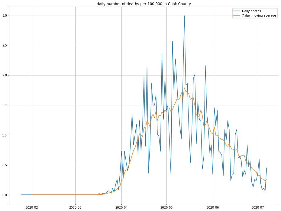
Note that I’ve inflated by daily deaths by 10% to account for the fact that not every death due to COVID-19 is reported. (This is one of a number of “back of the notebook” estimates that should breed a healthy amount of skepticism about this post!)
Based on this plot as well as the results of my previous simulations, the daily deaths look like they follow a log-normal distribution, so a scaled version of the log-normal PDF is the function I’m going to try to fit.
Specifically, I’ll fit this curve:
\[f(t) = \frac{\lambda}{t \sigma \sqrt{2 \pi}} \exp \left( - \frac{ (\log t - \mu)^{2}}{2 \sigma^{2}} \right)\]Here, $\lambda$ is a scaling factor, $\exp(\mu - \sigma^{2})$ is the location of the peak of the curve, and $\sigma$ is the variance of $\log f(t)$.
Let’s find the best choices of $\lambda$, $\mu$, and $\sigma$ using gradient descent in PyTorch so that we can pretend we’re doing deep learning.
First, set up the model. I’m initializing $\lambda$ and $\mu$ to eyeball guesses from the observed deaths data.
import torch
import torch.nn as nn

class LogNormal(nn.Module):

    def __init__(self):
        super().__init__()
        self.scale = nn.Parameter(torch.tensor(3e-5, dtype=torch.float))
        self.mu = nn.Parameter(torch.tensor(np.log(109), dtype=torch.float))
        self.sigma = nn.Parameter(torch.tensor(1, dtype=torch.float))

    def forward(self, x):

        arg = -1*((torch.log(x) - self.mu)**2)/(2*self.sigma**2)
        factor = (x*self.sigma*np.sqrt(2*np.pi))
        return self.scale*torch.exp(arg)/factor
Then, the training loop:
import torch.optim as optim

device = torch.device("cuda" if torch.cuda.is_available() else "cpu")

model = LogNormal().to(device)

# the target values
y = torch.tensor(daily_deaths, dtype=torch.float).to(device)
# the input is the day, as a number
X = torch.arange(1, y.shape[0] + 1, dtype=torch.float).to(device)

assert X.shape == y.shape

# pick your favorite optimizer
optimizer = optim.Adam(model.parameters())

# training loop - 5,000 steps
for _ in range(0, 5_000):
    optimizer.zero_grad()
    yhat = model(X)

    loss = (abs(y - yhat)).mean()
    loss.backward()
    optimizer.step()

# get our predictions
with torch.no_grad():
    preds = model(X).cpu().numpy()
Note that I’m using the mean absolute error as my loss criterion, rather than mean squared error. This is because the daily deaths data is very noisy, and MAE converged to a better result for me than MSE.
Here’s the result I get:
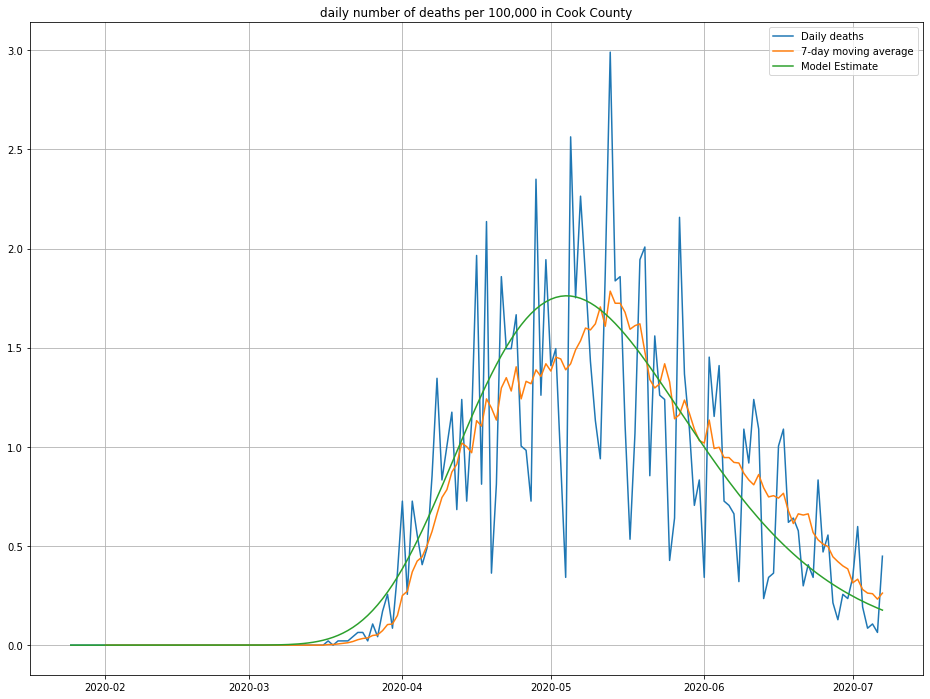
The line in green is the model’s predictions—looks about right! We can also look at the cumulative number of deaths and compare against what was observed, as a second sanity check:
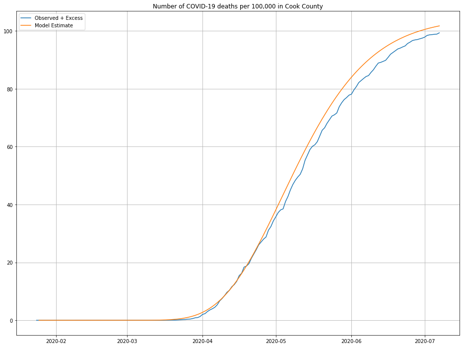
Looks close enough to me, maybe a slight over-estimate for more recent data.
So, how many people are infected???
To get out the number of infected from our death model requires two ingredients: the IFR, and a guess at median time to removal ($\gamma$). Given these parameters, our model is pretty simple: $I(t)$ = $f(t)/(\gamma \cdot IFR)$.
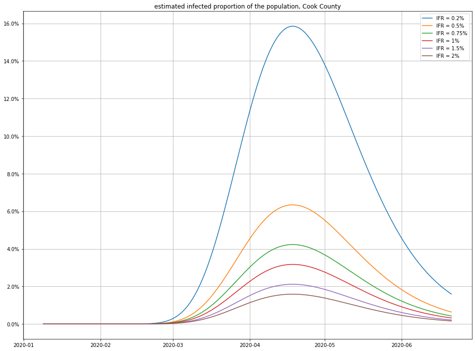
Here are a few different possibilities for IFR (using $\gamma = 1/18$):
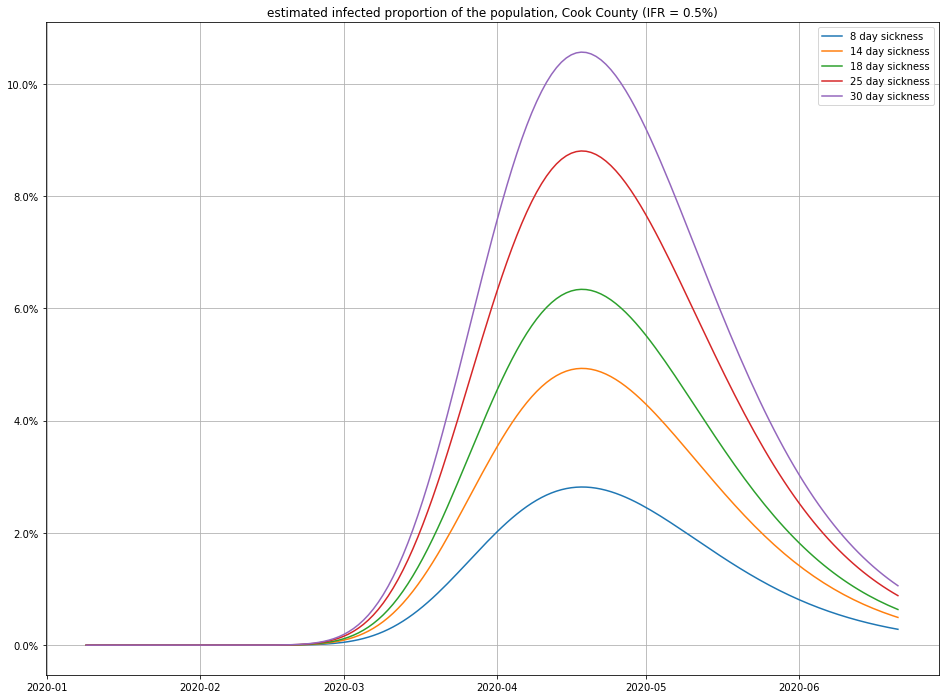
And here’s the impact of varying the recovery time:
Observe that small changes in IFR can have a big swing in the numbers of infections—this isn’t surprising, because a disease that only kills 1 in 1000 people who catch it (for example) would have to have infected 4.6 million people in Cook County to match the number of recorded deaths! (For comparison, there are only a little more than 5 million people total in Cook County, so this scenario seems unlikely.)
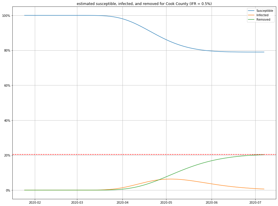
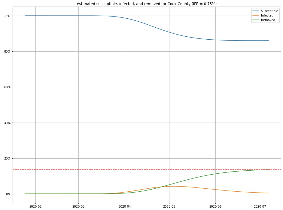
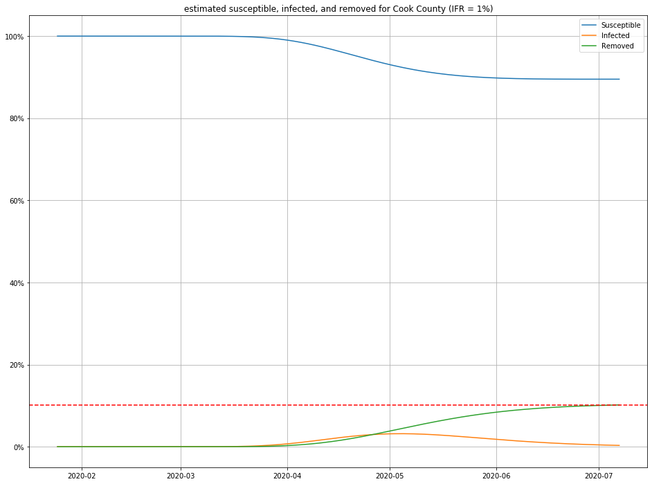
Once we have estimates for $I$ and $R$, it is straightforward to figure out $S$ as well, and produce population curves.
Here are a few, for different choices of IFR:
Conclusions
I’ll repeat the disclaimer that all of the above is highly speculative. That said, if you believe this model, I’ll make a few observations:
- For any IFR > 0.2% and any duration < 30 days, this model estimates the number of people currently sick with COVID-19 in Cook County to be less than 2% of the population.
- Even in an optimistic but plausible scenarios for IFR (0.5%), about 80% of the population is still susceptible to the virus.
Returning to our original questions of “how likely am I to catch COVID-19” and “where are we with the outbreak?”, here’s the conclusions I’d draw from this exercise:
- Probably 98% of the people you encounter on the street do not have COVID-19, so your chances of catching it in any given encounter are small. However…
- At least 80% of the population has not caught and developed immunity to the virus.
Consequently, while we are not in all that much danger here in Cook County, our safety is fragile: we are still quite vulnerable to another outbreak. Assuming that survival of an infection confers immunity for some meaningful amount of time, the outbreak will die out on its own if $R_{t} < 1$. $R_{t} = R_{0} S/N $. If $R_{0} \approx 2.4$, then we need $S/N \leq 0.42$, that is, at least 58% of the population needs to catch the virus—and we’re a long ways away from that!
If you’re interested in learning more about this subject, SIR models are surprisingly easy to get into, and generalize naturally to more sophisticated state-based approaches. Also, if you know another good way to model $I$ from publicly available data, or have a technique for estimating the IFR from observeable data, I’d love to hear about it!